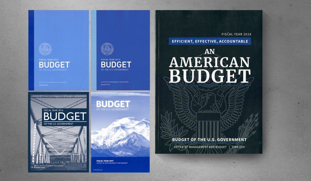
Judging a Book by its Cover: The 2019 U.S. Budget
The fiscal year 2019 budget proposal was recently released by the Trump administration and I was surprised by how much the cover reveals about the contents and its focus. The overall design of the cover could be anything so any critique will certainly seem like nit-picking to some, after all the layout doesn’t affect the numbers inside so why does the design even matter? But it is precisely because the design lacks constraints that makes this the perfect opportunity to ensure that it is well done.
WHAT THAT TITLE SAYS
An American Budget. I’ve tried to find as many past budgets as I could and have yet to see one that refers to the budget as an “American” budget. More typically, they’ve been called “Budget of the U.S. Government.” By labeling this an American budget, the administration is trying to use nationalism to woo acceptance of this document. It is easy to disagree with the U.S. Government, less so with America which implies a far greater scope.
For example, you may love your country but disagree with your government, that is an American tradition, but if you criticize “An American Budget,” you are criticizing America. Would that mean you are in jeopardy of being called treasonous? At a time when legislators who don’t clap for the president are called that, then perhaps.
Above the headline sits the qualifier, “Efficient, Effective, Accountable,” which aims to reassure the reader that the budget inside reflects these ideals. Unfortunately, it does not contain other qualifiers such as “Balanced,” “Non-Partisan,” “Equitable,” “Impartial,” “Civil,” “Forward-thinking,” or even “Fair.” Perhaps the inclusion of any of those words is for the best since they would have been seen by many only as ironic.
A FITTING DESIGN
As for the formal design of the cover, what does that communicate? First, the typeface for the title is Merriweather bold, designed by Sorkin Type Co. in 2010 and available free via Google fonts. The Sans Serif fonts appear to be Open Sans, another free font available from Google. The administration’s theme of making America great again proposes that we should buy American as a way to invest in our country’s future but by using free fonts instead of purchasing American-made ones, they’re choosing to not lead by example. While not an exorbitant expense by any stretch of the imagination, type design is a laborious process and type designers should be paid for their time and efforts.
The centered layout is a safe, if boring, choice. It looks like the cover of a hundred other books that will never be read. But the contemporary fonts used in this traditional layout are insincere and communicate a faux traditionalism—a look that wants to have the gravitas of a historical document without the sensitivity and understanding to achieve it. The use of the presidential seal screened in the background reinforces the theme that equates being an American with nationalism and the unquestioning loyalty to its iconography—symbols, flags, and seals. Contrast that to the covers of the 2016 and 2017 budgets with their images of a bridge and a mountain. The bridge reminds us that part of the budget funds infrastructure and the mountain reminds us that part of the budget protects and defends our national resources. There is no such message with the 2019 cover.
The covers from 2012 and 2013 are without imagery but are designed to communicate efficiency and economy (instead of having to state that as additional text). The sans serif font feels modern and the hierarchy of messaging emphasizes “budget” over all else. The presidential seal here feels like a stamp of approval, as a personal validation of the budget and not as a larger-than-the-cover symbol of what it means to be American. These are quiet, thoughtful, and well-designed utilitarian covers.
PRODUCTION COSTS
Hopefully, all of these are printed on 100{2fd61ab0ba50a553556d0eed1b7a661b66d725c223ec2a6f21fa1eda5e169cc2} recycled paper using soy inks on environmentally-friendly presses but I can’t tell. The 2016 and 2107 covers appear to have been printed in one color to minimize cost. The 2012 and 2013 may have also been printed in one color as well, certainly that is the most economical means of reproduction. Contrast that to the 2019 cover with at least two colors (both blues, one bright, one dull). That extra color adds an extra printing plate, more time to register the press, some added waste as a result, and increases the cost to the job some.
But I’m sure those extra costs are in the budget.


