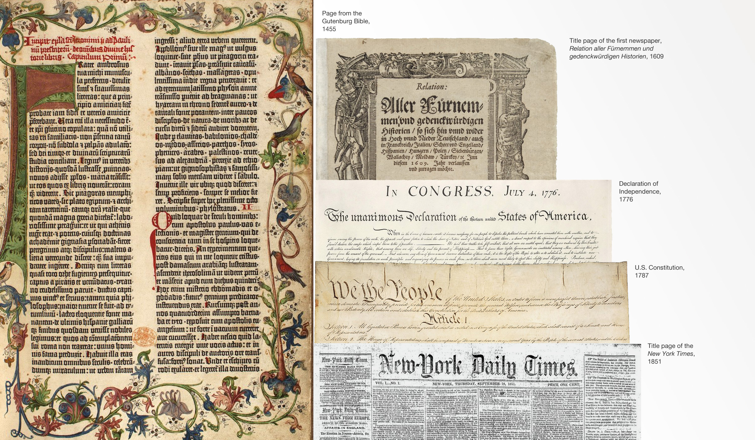
The New York Times, Los Angeles Times, Washington Post, and Chicago Tribune, aside from being trusted news sources, share a common design element—the mastheads use a similar type style. Why? A little typographic history
Johannes Gutenberg is credited with the creation of the movable type printing press in Europe around 1438. While woodblock printing was common in the 1300s, the innovations that Gutenburg made—oil-based inks, movable and reusable type, a matrix to enable the molding of new type blocks—allowed for the mass production of books and would lead to the proliferation and democratization of information on a scale never seen before.
His printing types were based on the handwritten texts of Western Europe and particularly of his native Germany at the time so that his books would be indistinguishable from the more labor-intensive, hand-copied manuscripts. At the time, Europe was in the middle of the Gothic architectural style with its pointed arches and flying buttress colonnades and these designs influenced the handwriting style. Text became more condensed, more stylized, and the result was Blackletter, also known as Textura (and the reason we call written passages of words “text” today).
The earliest newspapers date to 1605 in Germany and used that same traditional texture font, though, as the printing technology spread and Gothic styles gave way to the Renaissance, other regions developed fonts that bore a resemblance to their local handwriting. In Italy and France, for example, their early typefaces were based on humanistic scripts, and to our eyes, look very familiar.
But why would a German publication from 1605 affect the mastheads of today’s newspapers?
In a word—tradition. By the time the first printing presses were running in the colonies, the style of Gothic revival had spread in architecture. Initial caps in publications and manuscripts drew on that style as inspiration. The Declaration of Independence begins with Gothic-inspired calligraphy before transitioning to a humanistic script. The famous “We the People” from the constitution is also a form of Gothic-inspired calligraphy.
When modern newspapers began publication (the New York Times was first published in 1851), they adopted mastheads that conveyed a sense of historical significance, tradition, importance, and trust to their readers. Though Gothic Blackletter writing hadn’t been popular on a large scale in 300 years, they adopted the forms in their mastheads as a means of conveying these qualities. We still associate the Blackletter style with ideas of tradition, trust, and importance today and, after all, isn’t that what we want from our news sources?
One dark note to the Gothic letterforms—because of their German heritage, they were a favorite of the Nazis and, today, are often seen in neo-Nazi and white supremacist literature, symbology, and tattoos. Clearly, these Gothic forms convey a lot of meaning with regard to their historical context and, viewed through the lens of history, may signify very different things to different groups. A sense of history and tradition, yes, but who’s history and which traditions the reader will have to decide.

