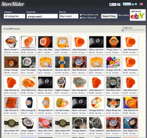
Finally, a Visual Search Engine for eBay
 There is nothing wrong with eBay’s search engine and in many ways, it approaches information search in the best way possible. But sometimes, particularly when you don’t know exactly what you want, a visual search is much, much better. Enter StoreSlider (storeslider.com), which allows users to perform keyword searches and returns a page of simple thumbnails as results.
If you’re searching for a carbon road bike that fits you perfectly, this isn’t the search engine for you. You can’t hope to use keywords to target your search closely enough. But if you want an orange watch (like I do), it just might lead you to the perfect stocking stuffer for yourself. My one chief gripe with the search is that so many sites allow users to click on thumbnails to enlarge the view in a lightbox that I automatically assumed that I could do the same here. Nope. Clicking takes you to the eBay page for more info. Still, the fact that I can see a page of thumbnails based on my search means I can see and compare more options quicker and easier. Now if it could search and compare items from different stores, I think it would be even awesomer.
Fluent: Returns a simple thumbnail interface of items from eBay.
Disfluent: Users need to click through to eBay to get more info.


