
The Limits of UI for UX
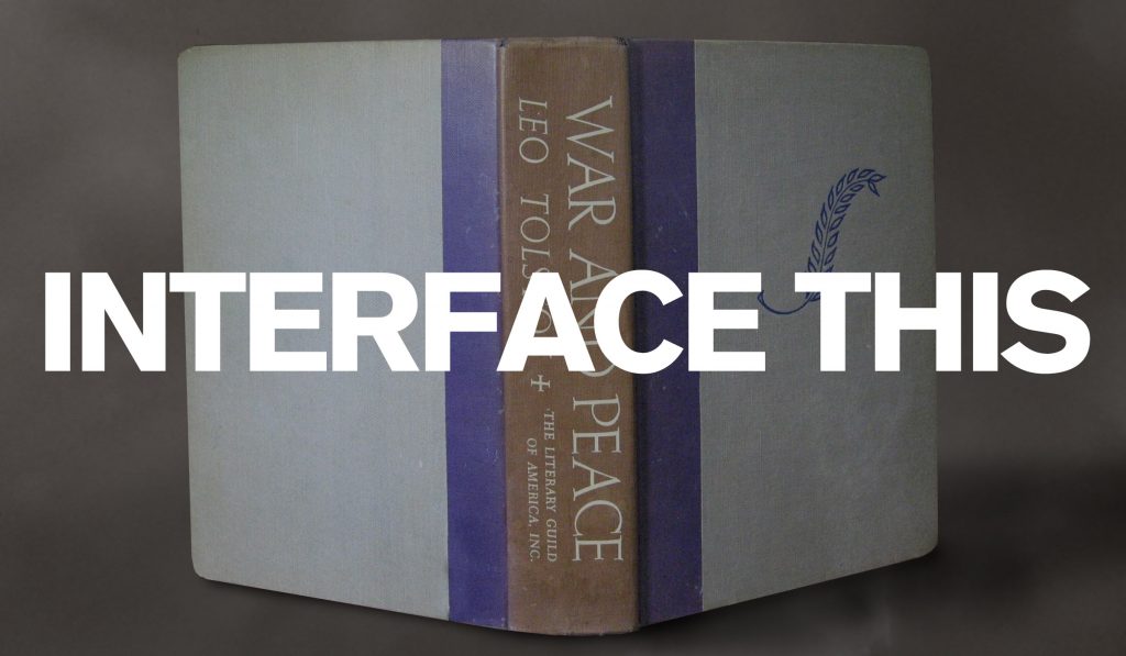
One of the advantages of being a professional designer for many years is that I’ve seen a lot of changes to the field over time. Some good—I haven’t had to wax a galley of phototype for a layout since the 80s—and some not. The industry today talks a lot about user experience and user interaction […]
Nostalgia Politics and the Fear of the New
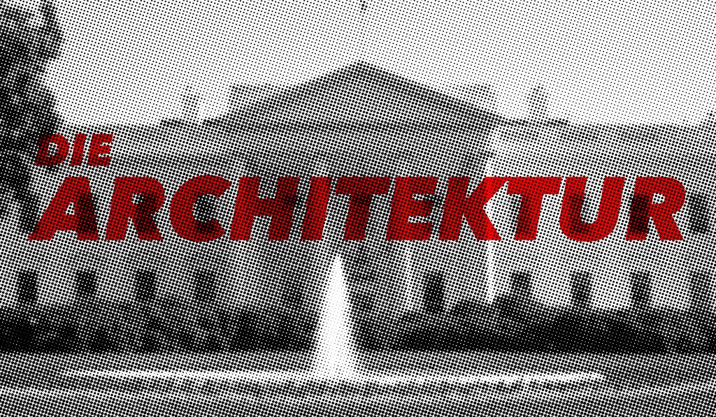
A recent draft executive order by the Trump administration called “Making Federal Buildings Beautiful Again” favors neoclassical designs for future federally-funded buildings, setting the style inspired by Greek and Roman architecture as the established ideal, discouraging modern design. This isn’t the first time a government has sought to impose an architectural style for new buildings […]
Is Your Font Conservative or Liberal?
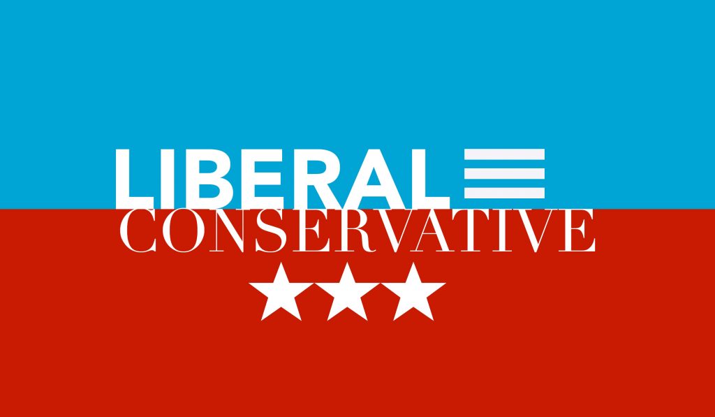
Is that font you’re about to use conservative? Is it liberal? What does it tell others about you, your business, your political affiliation? It’s a lot to consider. True, fonts are not conservative or liberal but people are and bring their proclivities into any dialog. People tend to associate serif fonts with conservative values and […]
What Modern Society Could Learn from Charlemagne
Today, we are faced with a curious phenomenon with regard to media. We have more sources today where we can access news and information, thoughts and ideas, while, at the same time, we’re more able to tune out sources we don’t want. We’re able to create self-sustaining media bubbles filled with voices we want to […]
Creativity Lost

Where did all the typographers go? Not graphic designers with typographic skills, but people who made their living as pure typographers who were responsible for setting cold metal, hot metal, and eventually phototype using machines and techniques that, mostly, are lost to the dustbin of time. Before the rise of the personal computer and the […]
Contextual Typography: The (Sorta) Fake History of Real News
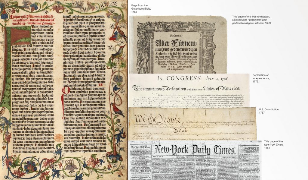
The New York Times, Los Angeles Times, Washington Post, and Chicago Tribune, aside from being trusted news sources, share a common design element—the mastheads use a similar type style. Why?A little typographic history Johannes Gutenberg is credited with the creation of the movable type printing press in Europe around 1438. While woodblock printing was common […]
Chief Wahoo, the Cleveland Indians, and the Tribal Nature of Brands

The Cleveland Indians announced that they were retiring their mascot, Chief Wahoo, after the 2018 season. The mascot had come under increasing criticism for being a racist depiction of Native Americans and the club decided that it was time for him to go. Perhaps unsurprisingly, a furor erupted from loyal fans who were angry at […]
Judging a Book by its Cover: The 2019 U.S. Budget
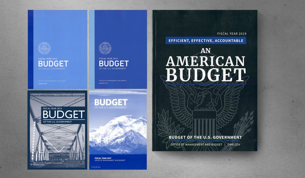
The fiscal year 2019 budget proposal was recently released by the Trump administration and I was surprised by how much the cover reveals about the contents and its focus. The overall design of the cover could be anything so any critique will certainly seem like nit-picking to some, after all the layout doesn’t affect the […]
SOTU and the Paradox of Craft in the Digital Age
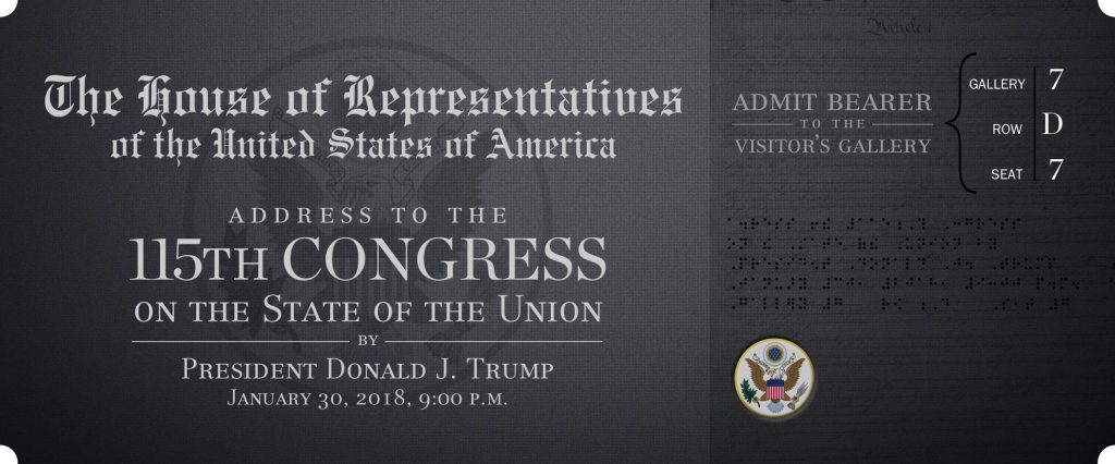
This week, the president of the United States invited visitors to his State of the Uniom address. That’s not my typo, that’s his. How can this happen? Carelessness? Laziness? Inexperience? Something else? What does it take to make sure an official communication from the president of the United States is spelled correctly? Very little, so […]
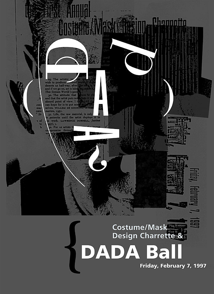
THE UNIVERSITY OF THE ARTS DESIGN POSTERS REVIVED
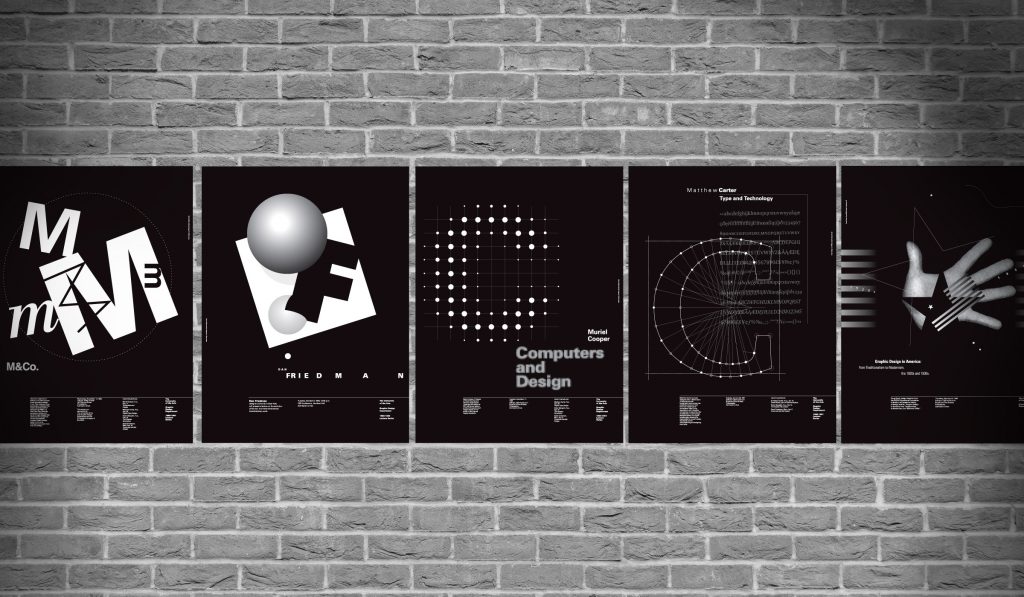
Between 1990 and 1992, a series of posters was created to announce lectures by famous designers and creative thinkers including Dan Friedman, M&Co., Matthew Carter, and Muriel Cooper. These simple diazo-process posters were never meant to last more than a week or so. Recently, we opened our archive and resurrected the series, or the ones […]
Mediocrity Campaign
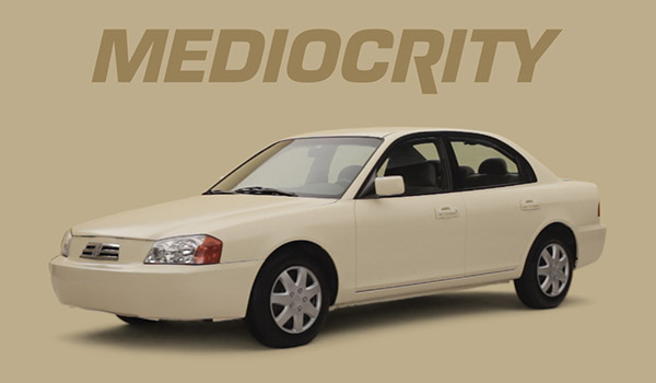
Subaru has a cool advertising campaign called Mediocrity. They’ve created a fake car called the 2011 Mediocrity, complete with faux ad campaign and complete website. The video above is the Apple-esque designer interviews, on how they were able to make the car so incredibly mundane. The spoof is honestly what it seems some designers/companies think. […]
We Interrupt this Package…
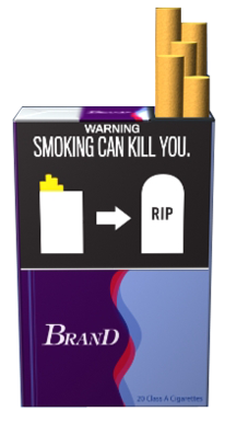
Today the FDA proposed a series of required warnings for cigarette packages and advertisements. Initially, 24 concepts were proposed of which 9 will ultimately be adopted. The basic formatting devotes half of the package or advertisement to a public service announcement alerting the user that, in no uncertain terms, smoking is really, really bad for […]
Legibility, Readability and Memorability
Would you rather be remembered or would you rather be understood? The question is legitimate for written messages and points out the difference between legibility, readability, and memorability. Legibility and readability are different tasks required by typographers. Legibility refers to the quality of the font, the proportions of the characters, consistency of the set as […]