
Contextual Typography: The (Sorta) Fake History of Real News
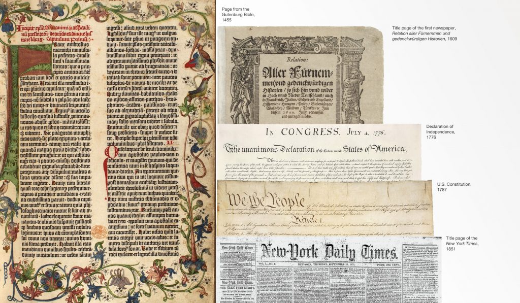
The New York Times, Los Angeles Times, Washington Post, and Chicago Tribune, aside from being trusted news sources, share a common design element—the mastheads use a similar type style. Why?A little typographic history Johannes Gutenberg is credited with the creation of the movable type printing press in Europe around 1438. While woodblock printing was common […]
Legibility, Readability and Memorability
Would you rather be remembered or would you rather be understood? The question is legitimate for written messages and points out the difference between legibility, readability, and memorability. Legibility and readability are different tasks required by typographers. Legibility refers to the quality of the font, the proportions of the characters, consistency of the set as […]