
The Limits of UI for UX
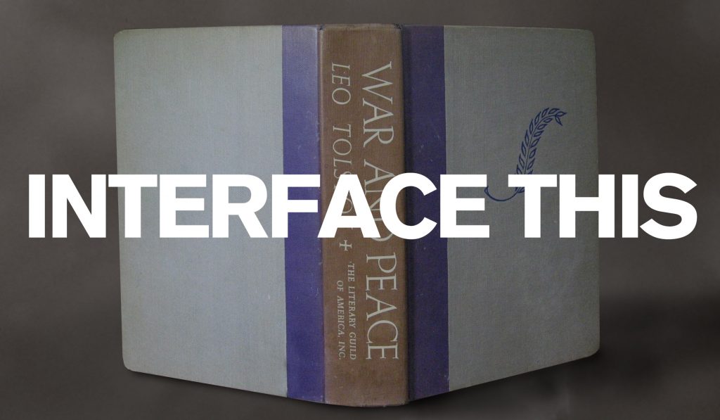
One of the advantages of being a professional designer for many years is that I’ve seen a lot of changes to the field over time. Some good—I haven’t had to wax a galley of phototype for a layout since the 80s—and some not. The industry today talks a lot about user experience and user interaction […]
Is Your Font Conservative or Liberal?
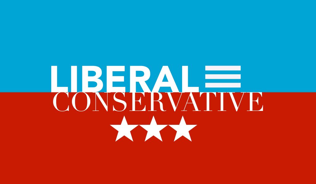
Is that font you’re about to use conservative? Is it liberal? What does it tell others about you, your business, your political affiliation? It’s a lot to consider. True, fonts are not conservative or liberal but people are and bring their proclivities into any dialog. People tend to associate serif fonts with conservative values and […]
What Modern Society Could Learn from Charlemagne
Today, we are faced with a curious phenomenon with regard to media. We have more sources today where we can access news and information, thoughts and ideas, while, at the same time, we’re more able to tune out sources we don’t want. We’re able to create self-sustaining media bubbles filled with voices we want to […]
Creativity Lost
Where did all the typographers go? Not graphic designers with typographic skills, but people who made their living as pure typographers who were responsible for setting cold metal, hot metal, and eventually phototype using machines and techniques that, mostly, are lost to the dustbin of time. Before the rise of the personal computer and the […]
Judging a Book by its Cover: The 2019 U.S. Budget
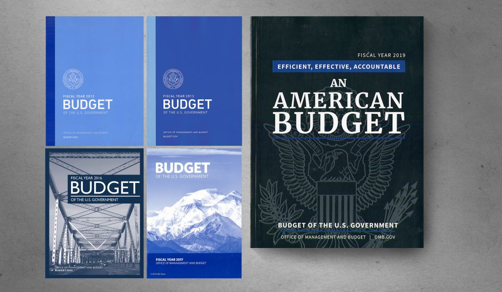
The fiscal year 2019 budget proposal was recently released by the Trump administration and I was surprised by how much the cover reveals about the contents and its focus. The overall design of the cover could be anything so any critique will certainly seem like nit-picking to some, after all the layout doesn’t affect the […]
SOTU and the Paradox of Craft in the Digital Age
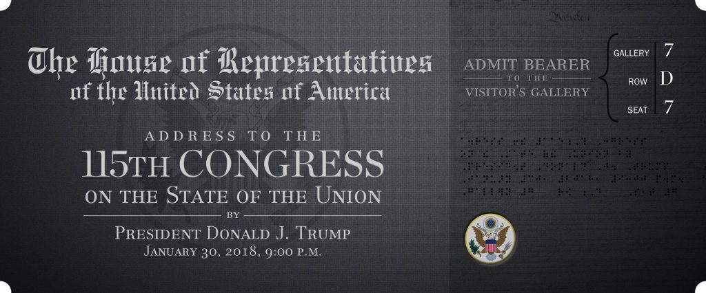
This week, the president of the United States invited visitors to his State of the Uniom address. That’s not my typo, that’s his. How can this happen? Carelessness? Laziness? Inexperience? Something else? What does it take to make sure an official communication from the president of the United States is spelled correctly? Very little, so […]
THE UNIVERSITY OF THE ARTS DESIGN POSTERS REVIVED
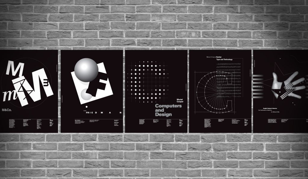
Between 1990 and 1992, a series of posters was created to announce lectures by famous designers and creative thinkers including Dan Friedman, M&Co., Matthew Carter, and Muriel Cooper. These simple diazo-process posters were never meant to last more than a week or so. Recently, we opened our archive and resurrected the series, or the ones […]
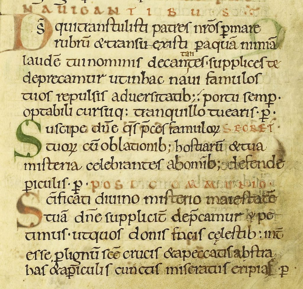
The History of the Book Flickr Set
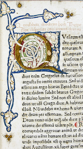
I’ve recently been spending way too much time over on the History of the Book Flickr set, a collection of some 20,000 photos of initials, ornaments, and type from Royal Library, The Hague, and the Archive of Alkmaar. Its author, Dr. Paul Dijstelberge has scanned thousands of pages from European printed works from the 15th […]
Flickermood 2.0
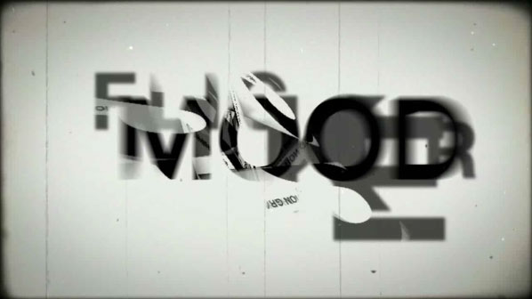
We love type. We love music. Put the two together and the results can be awesome. Check out the video above—a playful little typographical study by Sebastian Lange that’s a whole lot of fun (via insidefaceout). Check out more of his work here.
The Colosseum as Type
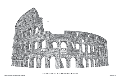
What began as a 10-year wedding anniversary to Rome concluded a year later as an artistic endeavor to reimagine the Coliseum with type. In March 2009, Cameron Moll and his wife, Suzanne, spent several days in Rome to celebrate their 10-year anniversary. This was also a chance to observe in detail the Coliseum, which […]
Linotype: The Movie
With the success of Helvetica: The Movie, and the forthcoming Herbert Matter movie, it would seem natural that someone would create a film about the rise and fall of Linotype. For those who don’t know, Linotype revolutionized the typesetting industry in the 19th century allowing vast amounts of text to be set quickly by a […]
For The Geek Typographer
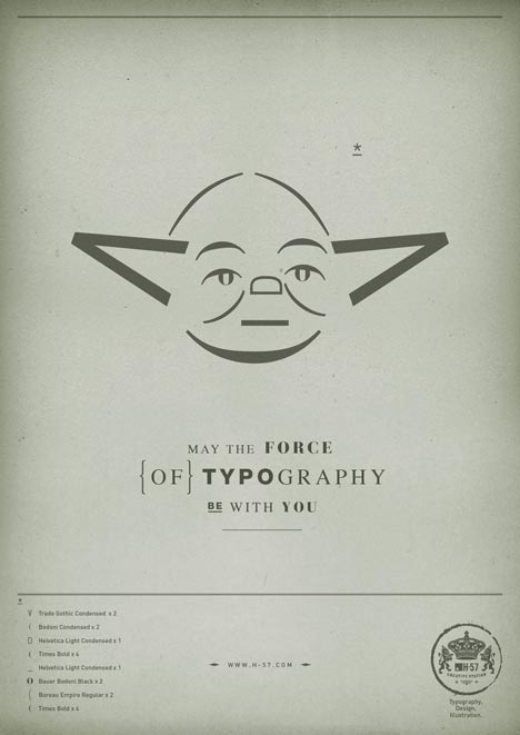
We love typography. We love Star Wars. So what’s not to love about these series of Star Wars inspired typographic posters? Using only typographic elements, the folks over at H-57 have created a series of posters entitled, “May the Force of Typography be With You.” Obviously, they’re just our “type” of thing.
So Much Typography
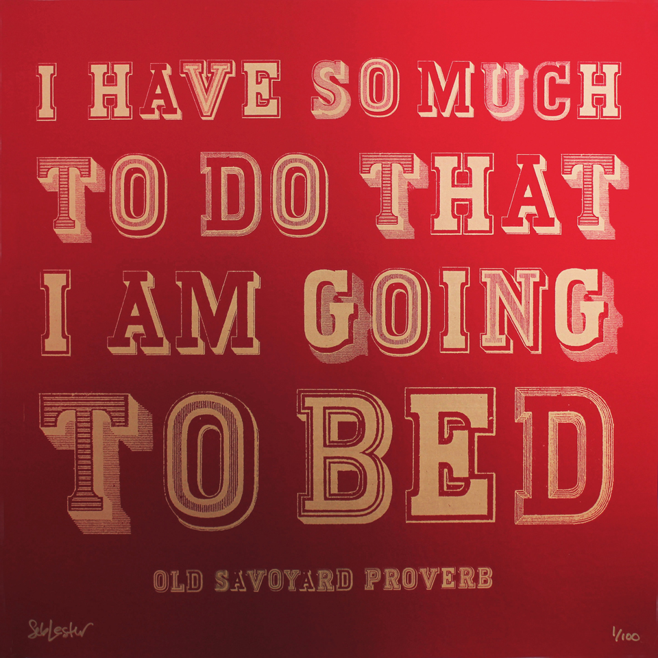
Typographer and type designer Seb Lester has created three striking screen prints using his unique typographic gifts. Over at iLoveTypography.com, he discusses the process he went through in creating these unique pieces. While at first, the pieces might seem straightforward, upon closer inspection, his attention to detail is superb. My favorite (and the one I […]
Disfluency: The Art of Making Things Difficult
Speech disfluencies are any of various breaks, irregularities, or utterances that are often not consistent with any specific grammatical construction and occur within the flow of otherwise fluent speech. These include, for example, words and sentences that are cut off mid-utterance, phrases that are restarted or repeated, repeated syllables, grunts or unrecognizable utterances occurring as […]